.webp)
From General Practice to a Distinctive Niche

When people seek out a therapist, they're often looking for someone who understands experiences that feel deeply personal. For Holly, that meant supporting athletes navigating identity beyond competition and expats adjusting to life in a new place. Her expertise was clear—but her brand wasn't communicating what made her practice truly different.
Our goal was to create an identity that reflected the depth of her work while helping the right clients recognize, almost immediately, that they'd found the right therapist.
The Opportunity
Mental health websites often look and sound remarkably similar. Soft colors, stock photography, and broad messaging can make it difficult for prospective clients to understand why one practice might be a better fit than another.
Rather than trying to appeal to everyone, we saw an opportunity to build a brand around the people Holly serves best. By embracing her unique specialties, we could create a practice that felt more personal, more confident, and far more memorable.

Holly's logo before wasn't bad, but it needed to feel more like her: more personal, more exciting, more moving and strong and bold. Different. AND it needed to be part of a system that could be used across different touchpoints for a cohesive, dynamic brand.


Holly quickly showed favor toward a highly saturated, slightly nostalgic palette that paired beautifully with a technical varsity typography scheme. Think Savannah Bananas meets badass counselor that feels like you're chatting with a bestie who keeps it real, always.
What We Built
We partnered with Holly to create a cohesive brand experience that balanced professionalism with warmth.
Together, we developed:
A refreshed visual identity rooted in confidence and approachability
Messaging that clearly communicates her specialties and philosophy
A custom website designed to guide prospective clients with clarity and ease
A flexible design system that supports future growth across digital and print
Thoughtful content structure built with accessibility, user experience, and search visibility in mind
Every decision was made with one question in mind: How can we make someone feel understood before they've even booked their first appointment?

A comprehensive, thoughtfully designed brand blueprint that considers everything from contrast and accessibility to color-specific psychology and typographic use indications.
The Outcome
The finished brand positions 516 Counseling as more than another therapy practice—it reflects a thoughtful specialist with a clear point of view. By narrowing the focus rather than broadening it, the practice now communicates confidence, builds trust more quickly, and creates a stronger connection with the people Holly is uniquely equipped to help. The result is a brand that feels every bit as intentional as the care clients receive once they enter a session.

We built a website full of movement and color, to stand alone bravely and boldly in a sea of beige, grey, and boring.


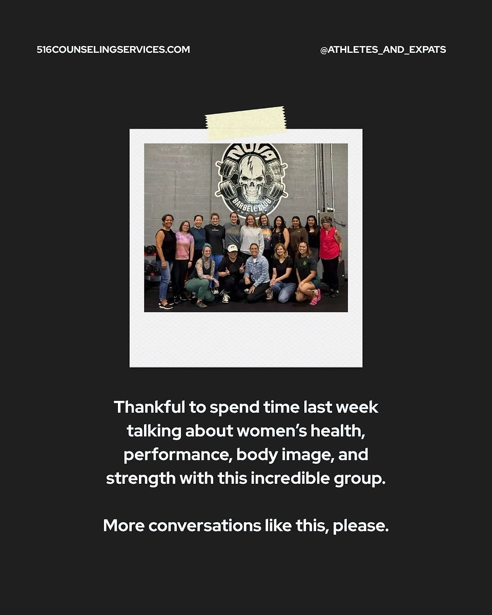


We created a social content cadence that helps Holly tell her story, highlighting real-time visits and anecdotes, all in a beautifully branded package.
Services
Brand Strategy • Visual Identity • Messaging • Website Design • UX Planning • Copy Direction • SEO Foundations • Creative Direction


Comments